Nossa Padel · Brand Identity System
Brand Kit
Brand Kit
& Style Guide
A complete reference for the NOSSA visual identity — colours, typography, logo usage, photography direction, and voice guidelines.
A complete reference for the NOSSA visual identity — colours, typography, logo usage, photography direction, and voice guidelines.
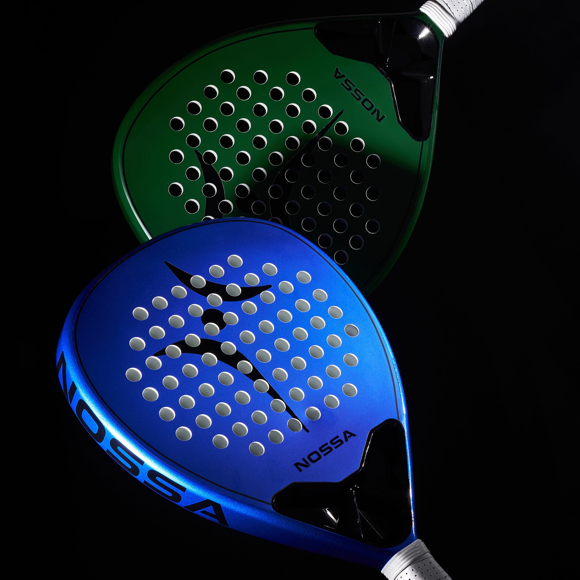
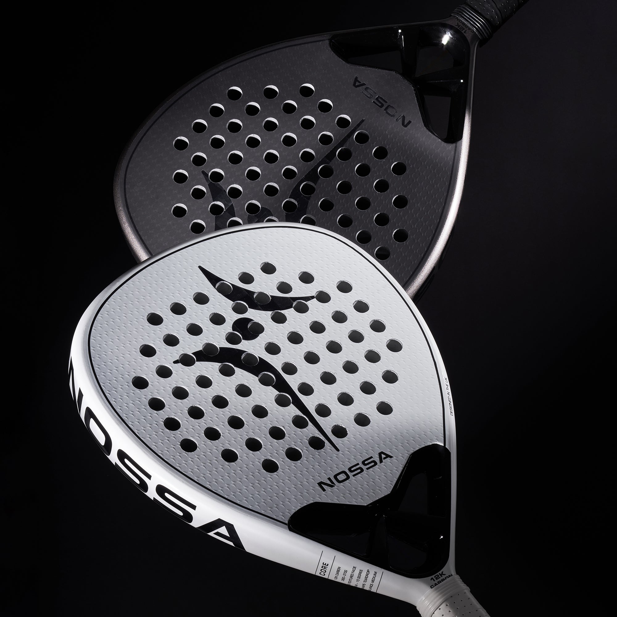
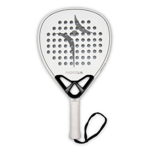
"We stripped away the noise. Durable materials, balanced design, and a racket that feels right from day one."
NOSSA was founded on the belief that the padel market was overcrowded with confusion. We exist to make premium padel equipment accessible, beautiful, and honest — built around community, not hype.
"In Portuguese, NOSSA means ours."
Padel is a game built for four, where anyone can join, everyone belongs, and new friendships are made every week. The name anchors the brand in community, inclusivity, and shared experience.
Premium without pretension
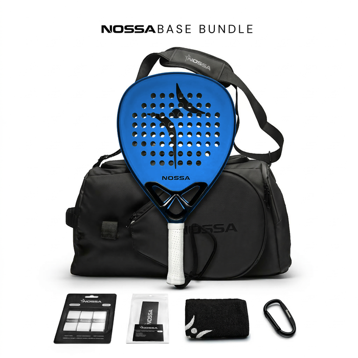
High-end equipment at an honest price. Quality-led, community-first.
Portuguese roots
Inspired by Iberian culture — warmth, community, passion for sport.
Feel right from day one
Months of R&D, 12K carbon, feel-first design. No gimmicks. Just quality.
Used exclusively on product surfaces (racket faces, bags). Never as primary UI colours.
Padel isn't just a sport. It's a lifestyle, a social circle — built for four, where anyone can join and everyone belongs.
Logo Anatomy

All values in pixels. Grid gap: 24px standard, 4px for photo mosaics. Section padding: 100px vertical / 60px horizontal.